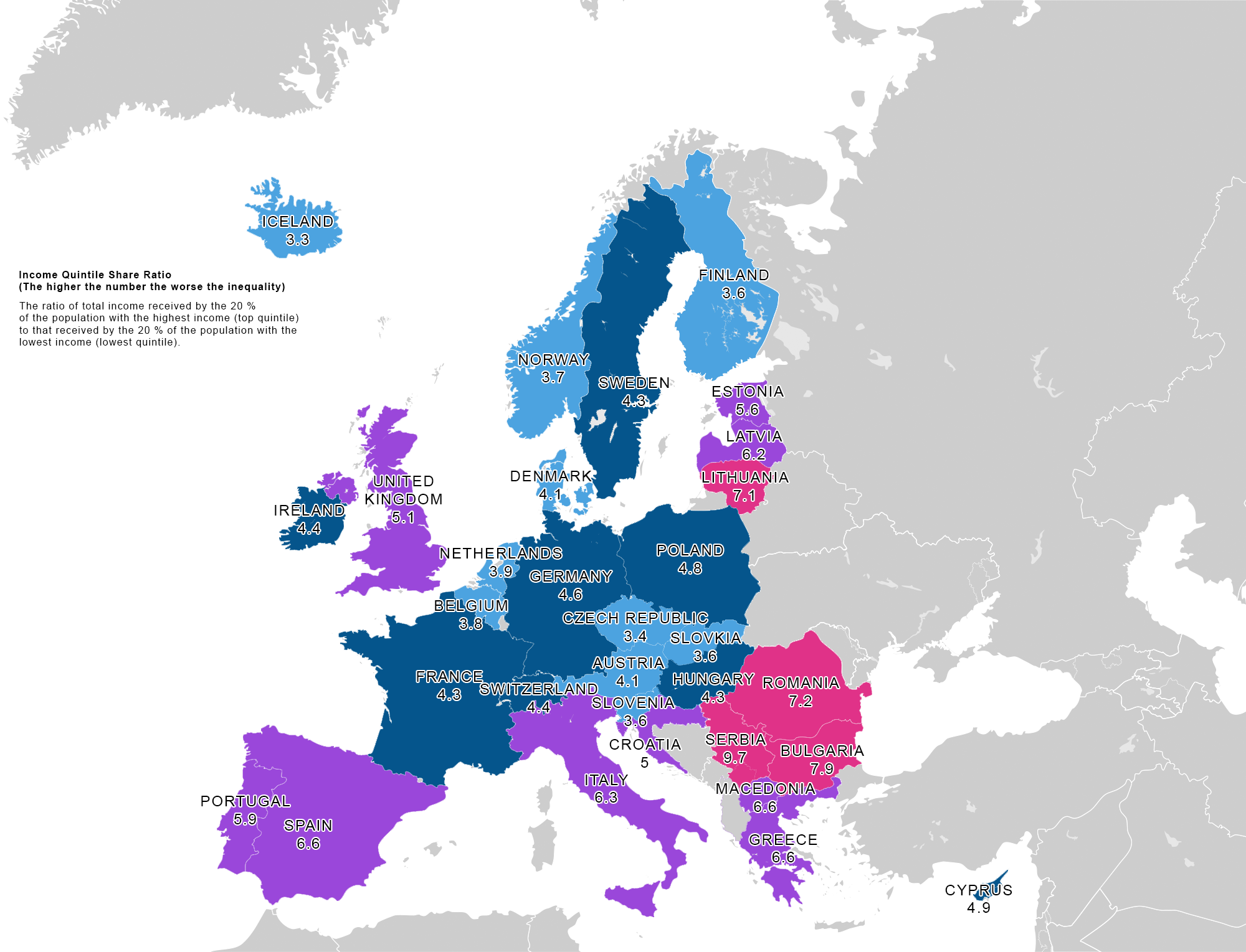
We collated income inequality stats into a graph and a map of Europe. This highlights which countries have income inequality issues. Not all European countries have been included. Notables like Russia did not have the data available as of time of publishing.
The formula that is used to derive the results in this article is “Income quintile share ratio”. This is the ratio of total income received by the 20 % of the population with the highest income (top quintile) to that received by the 20 % of the population with the lowest income (lowest quintile). Income must be understood as equivalised disposable income.
maybe swap the map and the graph i make the graph the featured image.
Bar Graph of Income Inequality Across Europe 2016-2017
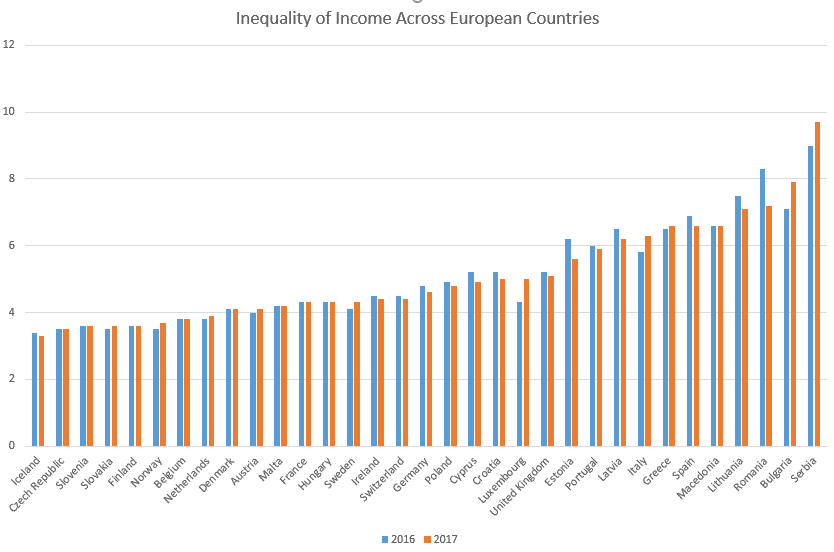
The above graph and map is based on the table below.
Table of Income Inequality Across European Countries.
| Country | 2016 | 2017 |
| Iceland | 3.4 | 3.3 |
| Czech Republic | 3.5 | 3.5 |
| Slovenia | 3.6 | 3.6 |
| Slovakia | 3.5 | 3.6 |
| Finland | 3.6 | 3.6 |
| Norway | 3.5 | 3.7 |
| Belgium | 3.8 | 3.8 |
| Netherlands | 3.8 | 3.9 |
| Denmark | 4.1 | 4.1 |
| Austria | 4 | 4.1 |
| Malta | 4.2 | 4.2 |
| France | 4.3 | 4.3 |
| Hungary | 4.3 | 4.3 |
| Sweden | 4.1 | 4.3 |
| Ireland | 4.5 | 4.4 |
| Switzerland | 4.5 | 4.4 |
| Germany | 4.8 | 4.6 |
| Poland | 4.9 | 4.8 |
| Cyprus | 5.2 | 4.9 |
| Croatia | 5.2 | 5 |
| Luxembourg | 4.3 | 5 |
| United Kingdom | 5.2 | 5.1 |
| Estonia | 6.2 | 5.6 |
| Portugal | 6 | 5.9 |
| Latvia | 6.5 | 6.2 |
| Italy | 5.8 | 6.3 |
| Greece | 6.5 | 6.6 |
| Spain | 6.9 | 6.6 |
| Macedonia | 6.6 | 6.6 |
| Lithuania | 7.5 | 7.1 |
| Romania | 8.3 | 7.2 |
| Bulgaria | 7.1 | 7.9 |
| Serbia | 9 | 9.7 |
Thanks to Eurostats for compiling these numbers.